Wednesday, October 31, 2018

Watercolor Transfer

Digital beginning

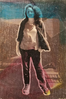
To start off the watercolor transfer I need to have something to eventually transfer. I used my pop art project and made a black and white version for a second print. After that I printed it out and stored it for later.

Watercolor

Once I had something to print I got prepared to make some water color sheets. Using classic water color tools I tried to paint one to look like rainbow blocks for the black and white piece. For the colored piece I made the paper a blue and purple gradient to match the pop art. After that I added red dots to spice it up a bit.

Mod podge 

Once the watercolor was finished I added the mod podge to the cut out pop art pieces and added it to the water color and used a squeegee to get the extra out of the bottom. I did this process for both pieces and set them out to dry.

Poly acrylic

Once the transfer print was completed I got some water to rub off the paper left after the print with some water. This took a couple of attempts to get the majority of the paper off but it ended off working well. Once that was all done poly acrylic was added to the prints to get the tiny bits of paper off to finish the piece.

Reflection

The printing process went pretty well in the end. I did pretty good up to the  rubbing part. I used too much water which made the water color bleed a bit which made the outer edge look a bit rough. Other than that i'm happy with the ending prints and good with the experience

Prints


Tuesday, October 16, 2018

Printing Processes

Relief Printing Process


     The printing process starts with a inked piece of wood prepared to be printed to a piece of paper. When a thin sheet of paper is pressed down against the wood with a baren. The grain of the wood affect the black areas of the print. This effect can be an advantage to an artist. Tools used are similar to a wood carver. This type of printing is like a flat consistent black board that you carve away to make white space to create a image with the depth of the piece itself. Imagine it being like a reverse drawing. This type of printing is the easiest to use and easiest to access, which is good for learning the basics of printing.
1) a wood block is toned with a black film ink
2) a carbon paper transfer can take place to transfer the paper
3) cut away the white areas with a wood carving tool
4) once the block of wood is ready ink is rolled over the block 
5) the block is pressed and transferring ink to paper 

Intaglio Printing Process

Intaglio is a print making process where the image is below the flat surface of your printing plate. This printing process is the process of getting a sheet of metal and making scratches into the metal which can hold ink. These scratches are moving the metal away from the area making a bump that can hold ink once you transfer the ink to the plate. These bumps make the ink a fuzzy line once printed. These bumps can also be texture for the piece later. Later in the process where we apply ground to the plate it makes the plate completely black. Unlike Relief where we add depth to the plate, we just remove the black sheet, this process also isn't like the scratching process. The copper showing through will be what the piece is in the end. After inking the plate and removing any residue from the top areas of the plate, the plate is pressed in the same way the Relief process is pressed.


1) prepare a plate for scratching or modification
2) scratch out the print on the plate
3) steel face the plate to make the plate stronger and more durable
4) prepare plate for etching 
5) apply ground to the plate
6) smoke the plate 
7) etch the plate
8) wipe plate with ink to force into into deep crevices of the plate

Lithography Printing Process

This process is about water and grease resisting each other. The stone is treated and etch is added into the stone. The tools to use are waxy like tools that can resist water, so the harder the material the darker the print will be. Most of the process is adding gum, lithotine and other materials to the stone to make ink stick to it.


1) stone is prepared with drawing
2) gum is added to stone to draw out white areas
3) soap is added stone which fades the drawing
4) wash surface and ink stone
5) prepare to press stone to force ink into stone
6) damp paper and press again to get complete print

Reflection

The process id attempt would probably be the Intaglio process because i'm most familiar with the process and I feel like would work best for me. The simplicity of the process itself make me feel like I could accomplish it. I also think the demographic of the type of printing would work for me. The plate system I also think would be easier and more enjoyable to work with. These old printing processes probably influenced some artist to go more deeper when it comes to printing, thanks to the modern age with new tools and machinery. But I think it can help artists when they need a type of design choice. Like for example a retro or a nostalgia feel for some people. 

Tuesday, October 9, 2018

Panorama Multi-Exposure

Personal Narrative

     Walking into the Renaissance festival I instantly felt immersed into the culture of the festival. It was my first time so I was anxious but after walking into the front gates the smell of the turkey legs and the root beer floats everyone was carrying around went into my nostrils. The commotion coming from everyone was distracting. I looked around seeing how large the festival was. It was huge! After leaving the main area and stepping onto the soft soil I  followed the path. I smelt pure disgust, looking onto the ground was balls of pure horse droppings. After looking at that I continued onto the path.

     My first stop was this magic show gag. Now if it was really the medieval ages and he claimed to be magical, he'd be hung for bein' a witch. But this isn't really the medieval times. The magic show was entertaining to say the least, but the feeling of the hard dry wood made it very uncomfortable. The magician had a little wooden magic wand, and had a white beard which fit the look of a wizard. Once that show was over I met up with some of my greatest buds, Alexis and Jeremiah, we went off to the sword fighting tournament and Jeremiah and I decided to join. The rules were simple, don't get hit, while she was explaining the rules I was just looking at this skeleton statue thing above the arena. It fit the barbarian look. When I was up into the ring I noticed that you couldn't leave the roped circle indicating the arena, and my opponent was a boy with a spear. When the woman started the match I was anxious, the soil felt like ice as I slid around trying to dodge his attacks, but it didn't work out in the end. I walked out of that arena empty handed.

     After that loss Jeremiah, Alexis, and I went on down to a performance where a man was doing tricks and making puns, the performance was a blast but midway I got a call saying that everyone was ready to leave, so I had to pack my bags and track my way back to the entrance. Once there we went through the exit and leaving the horse dropping smell behind. Walking onto dusty rocks made my shoes a bit dusty but once I got home I felt happy to experience the Renaissance festival.

Reflection

The panorama works well with the story by showing key points of the story within the picture itself. The picture goes in order (kinda) of the events that happen within the story. The project worked out pretty well in the end. The theme of The Renaissance Festival works pretty well due to the pictures within the project are actually from Ren Fest. The only part that i'm not happy about is the very right side not blending in very well, but I tried my best.


Monday, October 1, 2018

Pop Art

First Idea

I didn't really have an idea for my project I knew what I wanted but didn't plan before I started. I first cropped her out of the original image, made her black and white, then finally added color back. After that I added cool shapes and lines to make it seem more like a pop art design.

Color scheme

The color scheme I chose is like a purple to blue wave of color. The color goes with her clothing which is a blue outfit. The block colors were colors close to the original color palette.

Inspiration

I didn't have much of an inspiration, I kinda just winged it. The most inspiration I got was from Mrs. Scotts pop art, what I got inspiration was from the lines around the boxes, which I used for the subject and the blocks in the picture.

Techniques

To make the subject seem like there was no color taken out of her I got the eye dropper tool and took color from the original subject and colored it back in. Using a layer mask also made only the environment viewable through the blocks. To create the rain effect I got the brush tool and changed the brush to have this scratchy/ rain look effect.


The Pop Art itself