Process of making a logo
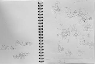
The process of making a logo is very time consuming but can be worth it in some situations. I have made a logo of my name and based it off my interests. Before I jumped onto illustrator I started with sketches on paper then I would move up from there (see sketches below). Once I had an idea on what my logo was going to be then I went onto illustrator and made black and white logos just to work on the look and not the colors. once I was satisfied with the logo I went on to see what would work with colors (see black & white and colored logos below). When I got my 4 favorite and put them in the middle of the art board and after some thinking I chose the one I liked the most (see final logo below).
Black and white logos that I was working on and trying to get the shape and more ideas out.
Colored in logos that I worked on and decided the four in the middle looked the best and picked one.


The final logo I chose, expanded so I could fine tune it and adjust how it looks.


